
The Monday Morning Dashboard: What Cloud ERP Should Show You Before Your First Cup of Coffee
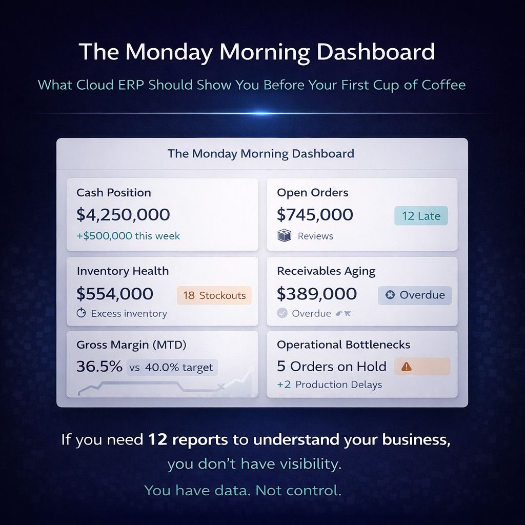
You walk in Monday morning. You sit down. You open your ERP. And within 60 seconds — before the coffee has cooled enough to drink — you should know exactly where the business stands.
Not an approximation assembled from Friday’s batch processes. Not a collection of reports that need to be run, downloaded, and manually cross-referenced. Not a dashboard full of vanity metrics that look nice on a screen but don’t connect to any decision you’ll make today. The actual state of the business, right now, in the form of information that tells you what happened over the weekend, what needs attention this morning, and what’s coming this week.
This is what real-time visibility actually means when it’s not a bullet point on a features page. It’s the experience of opening a system that already knows what you need to know and presents it in the context of what you need to do about it.
Most ERP dashboards fail this test. They show data without context, metrics without thresholds, and information organized by module rather than by relevance. They’re designed to demonstrate that the system contains data, not to help you act on it. The dashboard is a showcase for the vendor’s product. It should be a command center for your operation.
This article describes what a cloud ERP dashboard should actually show a distribution company on Monday morning — role by role, decision by decision — and why the ability to deliver this experience is an architectural test, not a cosmetic one.
Why the Dashboard Is an Architecture Test
A dashboard that shows you the current state of the business in 60 seconds requires something specific from the platform underneath it: every number on the screen must be current, must be consistent with every other number on the screen, and must reflect the same version of reality regardless of which department generated the underlying transaction.
This is trivial on a unified data architecture where every function writes to a single database. Every number the dashboard presents — inventory positions, open orders, receivables, shipment status, warehouse throughput, financial summaries — comes from the same real-time data layer. There’s nothing to reconcile because there’s nothing to diverge. The dashboard is a window into one reality.
On modular architectures where different functions maintain separate databases, the dashboard is a composite assembled from multiple sources, each potentially updated on a different schedule. The inventory number might reflect this morning’s data. The financial number might reflect last night’s batch. The order number might be current. The warehouse number might be hours behind. The dashboard looks coherent, but the numbers aren’t derived from the same snapshot of reality — they’re a collage from different moments, presented as if they’re simultaneous.
This is why two dashboards that look identical can deliver fundamentally different experiences. One tells you the truth right now. The other tells you an approximation assembled from data of varying ages. The architecture determines which one you’re looking at. The dashboard design just determines how it’s displayed.
The Operations Director’s Monday Morning
You run the distribution operation. Your Monday morning question isn’t “how’s the business doing?” — it’s “what’s on fire, what’s about to be on fire, and what can I ignore?”
What You Should See Immediately
Weekend order volume and status. How many orders came in over the weekend? How many were processed automatically? How many are in exception queues waiting for human attention — credit holds, pricing exceptions, stock allocation issues, EDI validation errors? The ratio between orders that flowed through cleanly and orders that need intervention is your first signal of the day. A high exception rate means the morning is going to be busy. A clean flow means you can focus on optimization rather than triage.
Current fulfillment position. How many orders are ready to ship this morning? How many are in picking? How many are packed and waiting for carrier pickup? How many are backordered, and what’s the expected resolution — incoming purchase orders, transfers in transit, production completions? This isn’t a historical report. It’s a real-time snapshot of where every open order stands right now, organized by urgency: what ships today, what ships this week, what’s at risk.
Inventory alerts. Which products have crossed below safety stock thresholds over the weekend? Which are approaching stockout? Are there incoming receipts or transfers that will resolve the position, or does purchasing need to act this morning? The dashboard should surface inventory exceptions proactively — not wait for you to go looking for problems, but present them organized by severity and business impact.
Warehouse performance metrics. What was Friday’s throughput — orders shipped, lines picked, units processed? How does that compare to the daily average and the target? Are there productivity trends that suggest staffing adjustments, workflow changes, or equipment issues? If the warehouse operates Saturday shifts, what happened yesterday?
Delivery exceptions. Did any shipments from last week fail to deliver? Are there carrier exceptions — damaged shipments, refused deliveries, address failures — that need resolution this morning? Are any customers waiting on deliveries that should have arrived and didn’t?
What You Should Be Able to Do From Here
The dashboard isn’t just a display. It’s a starting point for action. Every metric should be drillable — click the exception count and see the specific orders. Click the stockout alert and see the inventory position, the open POs, and the expected receipt date. Click the warehouse throughput number and see it broken down by shift, by zone, by associate.
And the actions triggered by the dashboard should be executable within the same system. The credit hold that needs review is resolvable from the dashboard. The stockout that needs a purchase order can initiate one. The delivery exception that needs a customer call surfaces the customer’s contact information and order history. The dashboard connects information to action without requiring you to navigate to a different module, open a different screen, or switch to a different system.
The Warehouse Manager’s Monday Morning
You manage the physical operation. Your Monday morning question is: what does the warehouse need to accomplish today, and do we have what we need to accomplish it?
What You Should See Immediately
Today’s workload. The total volume of work the warehouse needs to process today — orders to pick, receipts to put away, transfers to process, cycle counts scheduled. Not as a single number, but broken down by priority: customer orders with same-day ship commitments first, then standard orders, then non-urgent internal work. The dashboard should show whether today’s workload is manageable with the current staff or whether it signals a need for reallocation or overtime.
Receiving schedule. What’s arriving today? Which purchase orders are expected? Which transfers are in transit and due for receipt? Are there appointments scheduled? Is the receiving dock going to be slammed at 9 AM with three trucks arriving simultaneously, or is the flow spread across the day? Knowing what’s coming lets you staff the receiving area appropriately and plan putaway capacity.
Inventory accuracy indicators. What’s the current cycle count variance rate? Are there locations flagged for discrepancy resolution from last week’s counts? Are there products with on-hand quantities that don’t match the system position? Inventory accuracy is a warehouse metric that degrades silently if it’s not monitored daily. The Monday morning dashboard should surface accuracy trends before they become fulfillment problems.
Open exceptions. Short picks from last week that haven’t been resolved. Damaged product awaiting disposition decisions. Returns received but not yet inspected and restocked. Customer complaints related to warehouse operations — wrong items, incorrect quantities, damaged packaging. Each of these is a thread that needs to be picked up and closed.
Space utilization. Is the warehouse approaching capacity? Are there zones that are overstocked while others have empty locations? Are there products in temporary staging areas that should have been put away? For distribution companies managing warehouse space actively, utilization visibility prevents the slow creep toward a warehouse that’s full in some places and inefficient in others.
What You Should Be Able to Do From Here
Release pick waves for the morning’s priority orders. Assign receiving tasks based on the expected delivery schedule. Review and resolve inventory discrepancies flagged by the system. Initiate cycle counts for areas with declining accuracy. Reassign labor between zones based on the day’s workload distribution.
The warehouse dashboard shouldn’t require you to navigate into six different screens to understand the morning’s operational picture. It should present the picture and let you act on it from the same view.
The CFO’s Monday Morning
You’re responsible for the financial health of the business. Your Monday morning question is: where do we stand, and are there financial issues I need to address before they become problems?
What You Should See Immediately
Cash position and short-term outlook. Current cash balances, expected receipts this week based on accounts receivable aging and payment patterns, expected disbursements based on accounts payable coming due. Not a static snapshot, but a rolling short-term cash flow view that tells you whether the week’s cash position is comfortable, tight, or alarming.
Accounts receivable health. Total outstanding receivables, aging distribution, and — most importantly — changes since last week. Which accounts have moved from current to overdue? Which overdue balances have gotten worse? Are there large invoices approaching due dates that require attention? The AR dashboard should surface the accounts that need collection activity this week, prioritized by amount and aging severity.
Accounts payable status. What’s due this week? Are there early-payment discounts available that exceed the cost of capital? Are there vendor payments that should be held pending dispute resolution? The AP view should connect to purchasing and receiving data — showing you not just what’s owed but whether the corresponding receipts have been confirmed and matched.
Margin performance. What were last week’s margins — by customer segment, by product category, by location? Are there trends that need investigation? A customer whose margin has declined over three consecutive weeks might signal a pricing issue, a product mix shift, or a fulfillment cost problem. The dashboard should surface these trends automatically rather than waiting for a month-end analysis to discover them.
Financial close readiness. If it’s the first Monday of a new month, where does the prior month’s close stand? Are there unposted transactions, unmatched receipts, unreconciled accounts, or open items that need resolution? On a unified data architecture with real-time financial posting, the monthly close should be a verification exercise rather than a reconciliation marathon. The dashboard should confirm that transactions are posted, that balances reconcile, and that the close can be completed quickly.
What You Should Be Able to Do From Here
Drill into any receivable to see the invoice, the order, the shipment, and the customer’s complete history. Approve or hold payable disbursements. Investigate margin anomalies by navigating from the summary metric to the underlying transactions. Generate the reports that yesterday’s data already supports — without waiting for a batch process to produce them.
The CFO’s dashboard demonstrates the financial integration advantage of unified data architecture more visibly than any other view. When finance operates on the same real-time data as inventory, sales, and warehouse operations, the financial picture is always current. The numbers the CFO sees Monday morning aren’t an approximation waiting to be corrected at month-end. They’re the actual financial state of the business, as of right now.
The Sales Director’s Monday Morning
You lead the sales organization. Your Monday morning question is: where are the opportunities, where are the risks to existing revenue, and what does my team need to know this week?
What You Should See Immediately
Customer ordering patterns. Which key accounts ordered last week? Which didn’t — and should have based on their typical ordering cadence? A customer that usually orders every Tuesday and didn’t order last week is a signal worth investigating before it becomes a lost account. The dashboard should surface these pattern breaks automatically rather than relying on a salesperson to notice that a regular customer has gone quiet.
Open order status. Total open orders by customer, by region, by salesperson. Which orders are at risk of missing their promised delivery date? Which are on backorder and what’s the expected resolution? The sales team needs to know about delivery problems before the customer calls to complain — because proactive communication about a delay is relationship management, and reactive apology after a missed delivery is damage control.
Pricing and margin alerts. Were any orders placed last week at margins below threshold? Were there manual pricing overrides that need review? Are there customer accounts where margin has been declining over time? The sales dashboard should surface pricing health as a proactive metric — identifying margin erosion before it becomes a pattern and enabling the sales director to address it through coaching, pricing review, or customer conversation.
New customer activity. How many new accounts were set up last week? What’s their initial order volume and margin profile? Are there new customers that need onboarding attention — setup of customer-specific pricing, EDI configuration, compliance requirements?
Quote and pipeline activity. Open quotes pending customer acceptance. Quotes that are aging without response. Opportunities that the sales team is tracking. The conversion of pipeline to orders over the past week and month.
What You Should Be Able to Do From Here
Click into any customer to see their complete history — orders, shipments, invoices, payments, pricing agreements, and communication notes. Identify at-risk accounts and assign follow-up to the responsible salesperson. Review and approve pricing exceptions. Generate customer-specific reporting for sales review meetings. The dashboard should equip the sales director to run the Monday morning sales meeting directly from the screen — with real data, current as of this moment, requiring no pre-meeting report assembly.
The Purchasing Director’s Monday Morning
You manage the supply chain. Your Monday morning question is: are we positioned to meet this week’s demand, and are there supply-side risks I need to act on today?
What You Should See Immediately
Stock positions against demand. Which products are below safety stock? Which are approaching stockout based on current demand velocity? Which have open replenishment orders, and when are they expected to arrive? The dashboard should distinguish between products that are low but covered by incoming orders and products that are low with no resolution in the pipeline — because the first needs monitoring and the second needs immediate action.
Open purchase order status. Which POs are due this week? Which are overdue from prior weeks? What’s the vendor’s on-time delivery performance for the overdue items — is this a pattern or an anomaly? The purchasing dashboard should surface vendor performance metrics not as a quarterly report but as a daily operational tool that informs this week’s follow-up calls and this month’s vendor conversations.
Suggested replenishment. Based on current stock positions, open demand, historical consumption patterns, and configured lead times and safety stock levels, what does the system recommend ordering today? The purchasing director should arrive Monday morning to a set of system-generated purchase order suggestions — reviewed and approved rather than built from scratch. This is where the ERP earns its value in purchasing: transforming the purchasing function from a manual analysis exercise into a review-and-approve workflow driven by the system’s real-time demand and inventory intelligence.
Cost variance alerts. Have any recent receipts arrived at costs significantly different from the purchase order price? Are there vendor price increases pending that affect upcoming orders? Are landed cost estimates diverging from actual landed costs in ways that affect margin? The purchasing director needs cost visibility in real time — not as a month-end surprise when finance discovers that actual costs don’t match standard costs.
Inbound logistics. What’s in transit? Where is it? When is it expected? Are there shipments from overseas suppliers that are delayed in customs, delayed in transit, or delayed at port? For distribution companies with international sourcing, inbound logistics visibility is a daily operational requirement, not a supply chain planning exercise.
What You Should Be Able to Do From Here
Convert suggested purchase orders into actual POs with a review and approval workflow. Contact vendors about late deliveries with the performance data to support the conversation. Adjust replenishment parameters based on changing demand patterns. Update expected receipt dates as transit information changes. The purchasing dashboard connects supply intelligence to supply action within the same system.
What the Dashboard Reveals About the Platform
The Monday morning dashboard is a diagnostic tool for the ERP itself — not just for the business. What the dashboard can and can’t show you tells you everything about the platform underneath it.
Can it show real-time data? If the inventory numbers are from last night’s batch process, the dashboard is a historical display, not a command center. If the financial data lags the operational data by hours, the numbers aren’t consistent with each other even though they’re displayed on the same screen.
Can it span functional areas in a single view? If the operations director’s dashboard can show orders, inventory, warehouse status, and financial impact in one view, the data architecture is unified. If these elements require separate dashboards pulling from separate sources, the architecture is modular regardless of what the interface looks like.
Can it drive action? If the dashboard displays information but requires you to navigate to a different module to act on it — a different screen to approve an order, a different system to check carrier status, a different report to drill into a number — it’s a reporting tool, not a decision tool. The best dashboards connect insight to action without leaving the view.
Can it be role-specific? If every user sees the same dashboard, the platform doesn’t understand that different roles have different needs. An operations director, a warehouse manager, a CFO, a sales director, and a purchasing director need fundamentally different views of the same underlying data. The platform should deliver role-specific dashboards that present each role’s most critical information without requiring custom development.
Does it surface exceptions proactively? If you have to go looking for problems — querying reports, filtering lists, scanning data — the dashboard is passive. If the dashboard tells you what needs attention before you ask, it’s active. Active dashboards — with threshold-based alerts, pattern detection, and exception highlighting — are the difference between a tool that informs and a tool that enables.
The Gap Between What You Have and What You Should Have
If your Monday morning currently involves running reports, opening spreadsheets, making phone calls to the warehouse, and spending the first hour assembling a picture of where the business stands — the gap between your current experience and the experience described in this article is the gap between your current system’s architecture and what a modern, unified, real-time platform delivers.
That gap isn’t a dashboard design problem. You can’t fix it by hiring a consultant to build a better reporting layer on top of a system with batch-processed data and modular architecture. You can’t fix it with a BI tool that assembles a pretty picture from fragmented sources. The gap is architectural, and closing it requires a platform that delivers real-time, unified, integrated data as a structural characteristic — not as a feature add-on.
The Monday morning dashboard is the simplest, most tangible test of whether an ERP platform delivers what it promises. If you can sit down, open the system, and know where the business stands in 60 seconds — with current data, consistent data, and actionable data — the platform works. If you can’t, it doesn’t, regardless of what the features page says.
What Monday Morning Looks Like on Bizowie
Bizowie’s unified data architecture means every number on your dashboard is current, consistent, and drawn from the same real-time data layer. The inventory your operations director sees is the same inventory your sales director is quoting against, which is the same inventory your warehouse is picking from, which is the same inventory your financial reports are valuing. Not approximately. Exactly. Right now.
Role-specific dashboards present each role’s critical information — orders, inventory, financial health, warehouse status, purchasing intelligence, customer activity — in views designed for how that role actually uses the data. Exceptions surface proactively. Metrics connect to the underlying transactions through drill-down. And the actions those metrics suggest — approving orders, releasing pick waves, generating purchase orders, investigating variances — are executable within the same platform.
No report assembly. No spreadsheet cross-referencing. No phone calls to the warehouse to find out what actually shipped. No morning spent building the picture that the system should have presented the moment you logged in.
See what Monday morning should feel like. Schedule a demo with Bizowie and we’ll walk through the dashboard experience — role by role, metric by metric — on a platform where the data is real-time, the views are role-specific, and the first 60 seconds of your day tell you everything you need to know to run the next eight hours.